


Tuesday, 22 December 2009
Wednesday, 25 November 2009
Suminagashi and Harunobu.
*******************************************


Suminagashi is the japanese way of marbling.
Literally: "floating black ink".
In the past Leyden fair, Aaldert, from Boektotaal,
gave a demonstration of this technique.
Literally: "floating black ink".
In the past Leyden fair, Aaldert, from Boektotaal,
gave a demonstration of this technique.

The arrangements could be seen by the public,
and spectacular means were used.
It is necessary to prepare the ink meticulously
so that it could float perfectly on a tray of pure water.
and spectacular means were used.
It is necessary to prepare the ink meticulously
so that it could float perfectly on a tray of pure water.

When everything is ready,
by using two brushes,
one loaded with ink
and the other with a dispersing agent,
a drop of every brush is left
on the surface of the water,
and at the end the tray will be full of concentric circles
formed by the alternation of the two
substances.
At this moment the air can appear,
it will help us if we have a fan at hand.

An original and unique design will be got on every paper.

Although, I have to say that Aaldert does not like that thing with the fan and
he did not use it in his demonstration.
***
he did not use it in his demonstration.
***
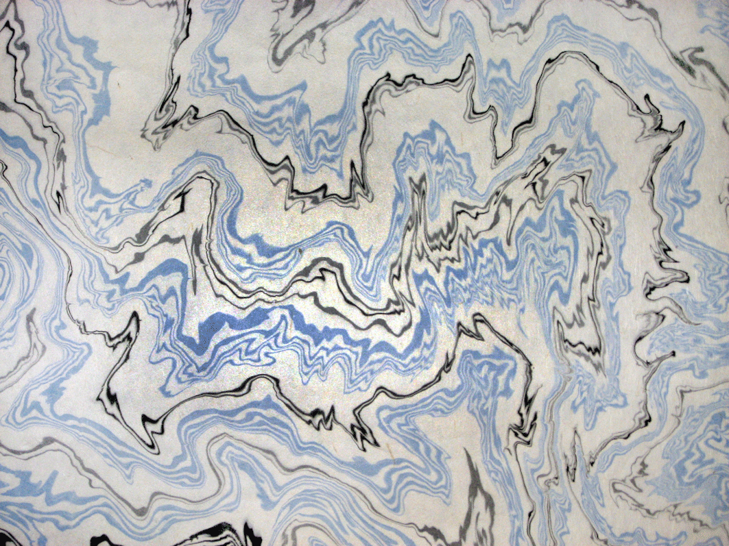
The most traditional suminagashi was done with black ink,
but later the blue ink and the red one were added.
The paper opening this article,
from the doctor Sidney Berger’s collection, in Boston,
it is a good example.
With it we can see clearly
the aspect of these papers.
but later the blue ink and the red one were added.
The paper opening this article,
from the doctor Sidney Berger’s collection, in Boston,
it is a good example.
With it we can see clearly
the aspect of these papers.
They exist documents dated in the XIIth century
with calligraphy executed with suminagashi as a background,
therefore it is believed that this technique is probably millennial.
with calligraphy executed with suminagashi as a background,
therefore it is believed that this technique is probably millennial.

The above scene is the XII sutra
of the
Semmen Koshakyo.
I like it so much that I asked my sister Adela
to paint a copy for me, oil on table,
this one shown here and that I have in my office,
so I can enjoy it every day.
It has everything:
the shape of a fan,
the calligraphy,
the miniature...
...and the suminagashi.
Notice how the painter respected the suminagashi background
and drew the figure of the left in two parts.
Today suminagashi is known in the whole world and
the list of artists who use it
and transform it is endless.
the list of artists who use it
and transform it is endless.

This tree is one of the most typical compositions
of
Milena Hughes.
At first sight one knows it is hers.
****
Sometimes I have tried to make suminagashi,
and if I have got something it has been by chance.
This paper reminds me "The big wave" by Hiroshigue,
one of the artists of the Ukiyo- e,
the famous japanese pictures of the Edo period.

of
Milena Hughes.
At first sight one knows it is hers.
****
Sometimes I have tried to make suminagashi,
and if I have got something it has been by chance.
This paper reminds me "The big wave" by Hiroshigue,
one of the artists of the Ukiyo- e,
the famous japanese pictures of the Edo period.


But my fan changed the sacred mount Fuji
in a kind of polar bear.
And this takes me where I wanted to be.
The other day I typed in “google”, in images:
"Harunobu".
Another artist of the same period:
Suzuki Harunobu (c. 1724-1770)
Do you know what has happened?
That the third image that appeared in my computer was this one:
"The big monkey"
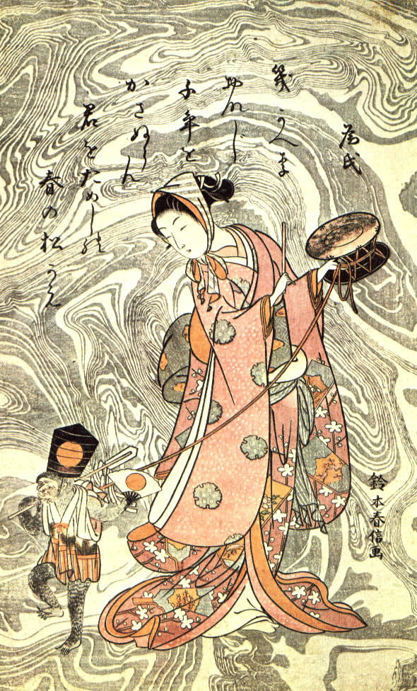
A comical interpretation,
it is I who says,
of what does this artist thought about the couples relations.
Let’s say... about who of the two wears the pants at home.
It is an engraving and the suminagashi has been printed on a wooden block,
just as the rest of the drawing.
It is not a true suminagashi,
it is an evocation of it that does not indicate another thing
than the respect of the artist towards the venerable tradition,
the same feeling of the fan’s miniaturist.
Harunobu did not do something like this only one time.
He repeated it in another engraving,
"Kanzan and Jittoku"
two monks studying a love letter,
some burlesque personages of the epoch of Tang dynasty (618-907).

I knew this engraving long ago,
I even saw it last year in Barcelona,
in an exhibition on the Ukiyo- e in the “Pedrera”,
the Gaudí building,
because in Barcelona pleasures never come alone, but in pairs...
...at least.
I got the surprise the other day by having found "The big monkey" for the first time.
I knew that Harunobu had used also a suminagashi background in this engraving,
and an auction allowed me to watch it finally.
Now, you can enjoy the two engravings simultaneously.
Something that has been hard for me to get,
I could obtain both only over much time and a lot of luck.
But if you do a foul-up to yourselves with the japanese word
I can recommend to you a short cut.
You can pronounce it as all people do it
when they hear this word for the first time:
s u m i... W H A T?
Copyrights: My gratitude to Aaldert, to doctor Berger and to Milena Hughes for his kind authorization to include their images. The engravings can be founded freely on the internet from some art galleries.
Monday, 16 November 2009
Jan van Oostrum
************************


This November, 7th and 8th ,
the book arts fair,
took place in Leyden (The Nederlands)
like every year.
St. Peter Church,
now detached from faith and tied this weekend to reason,
it is an absolutely fascinating building for this event.

Artists books,
calligraphy,
bookbinding materials,
and diverse activities
fill the ancient sacred place with life .
JAN REIN VAN OOSTRUM
was the protagonist of one of them:
a marbling demonstration.

He devotes himself to do these demonstrations all around Europe.
Demonstrations that provide an enormous pleasure to him,
you already could see his concentration and that of his public.

I met him in Belgium last April,
in Sint Nicklass fair.
He invited me to attend how he marbles one of his papers
and, from then on,
I knew that Jan loves marbling at least as much as I do.
I met again him at the fair of Cologne.

But I could only manage to do these photos in Leyden,
where I could also share a little bit of chat with him.
I very much like what he does, how he does it and why he does it.
And the next time, if he wants, I’ll make a video of him.
A cordial greeting, Jan.
Friday, 30 October 2009
Finally¡ A decorated papers guide.
**************************
Susanne Krause is one of the paper decorators,
the technique she uses is paste papers,
more known nowadays.
 I have obtained a photo of her in the fair of bookbinding of Cologne,
where she was with her papers
and with her books.
Because Susanne is versatile,she does not limit herself to paint papers,
but also she writes and publish her own books.
One of Susanne's phrases that more attracted my attention
was that one in which she mentions that
every generation loses some secret of some technique of paper decoration.
With every master who disappears
it disappears also some formidable trick that only he knew.
That's why it is so important not only to maintain the production of decorated papers,
but to spread the decorative techniques with teaching and, why not,
with the publication of works that are
the archive that we bequeath to future generations.
 Susanne's first book, in collaboration with Ilona Hesse,
was a small review of the different paper decoration techniques:
On handmade decorated papers (ISBN 9783938423158),
with two editions, the first one in 2000 and the second one in 2007.
 The second one a specific work on her technique:
More on paste papers (ISBN 3-938423-07-2),
published on 2005.
 The third one, in 2007,
International decorated papers: beyond the sample book
(ISBN 9783938423202).
A luxurious compilation with original samples of 25 international artists.
And the fourth one …
...the fourth one is the one that I want to present to you now
and the reason of this article.
Susanne's last book,
newly published
was presented in the past Frankfurt bookfair,
a couple of weeks ago.
 Decorated paper: a guide book. (ISBN 978-3-938423-17-2)
Under this simple title appears a fundamental book
for the recognition and appreciation of decorated papers,
of its diverse achievement techniques,
traditional ones and modern ones are included,
and of its designs.
The decorative techniques are not described
but the question is to recognize to which of them must belong
the paper that is possessed which could be identified
with this valuable help.
It is a field guide.
Just as a butterfly is seen in the field
and it’s made the research to identify its specie
with the help of a lepidopterous’ guide,
a decorated paper appears in the endleaves of a book,
or in another place,
that will be identified
with Susanne's new book.

The descriptions are simple and clear
and the illustrations, 113 full colored,
come from the funds of the collection of decorated papers
of the Royal Library of The Hague;
of the German Museum of the Book and Writing (Leipzig);
of the Library of the princess Ann Amalia (Weimar)
and of private collections
and artists.
The text appears in three languages:
German, Dutch and English
and was written by specialists of the mentioned institutions:
Henk Porck, Julia Rinck, Frieder Schmidt and Ida Schrijver.
Any more guarantees cannot be asked.
Nothing more than to wish an enormous success to this publication
that confirms the great interest that exists at present in this topic.
A work that should be present in any library,
private or public.
I hope that soon there could be the second edition,
with even more illustrations...
... and with the text also in Spanish,
something really easy to solve.
These books could be ordered directly to Susanne: http://www.hamburgerbuntpapier.de/
or by mail to studio@hamburgerbuntpapier.de
or by mail to studio@hamburgerbuntpapier.de
Sunday, 18 October 2009
The world's most expensive book.
*****************
Some time ago I asked you to send to me photos of your works with my papers,
and there have just come to me some of them:
a wonderful work that hides a sad story.

The authors of this binding are a craftsmen's couple
living in a famous Spanish city,
one of those four or five that were more
of what they are today.
They have a small and beautiful workshop,
with a wall covered with old brick,
that enhance moreover their work.
They live of an ancient craft.
They make folders, books, diaries, agendas,
all kind of stationery objects.
Only with his hands
and with a very few things more:
paintbrushes, glue, paper, pasteboard...
They make all these objects during the year
and then they recover the investment
and slightly more to keep on living,
in the traditional Craft’s Fair
that is celebrated in its city,
as in so many others of Spain,
during Christmas.
They are doing this for years,
but every time
it is necessary to present a representative work of what they do,
and wait for the admission
and the places' draw.
This year they presented the book that you have seen,
which they protected with a coordinated box.

I love it because I know the good taste that they have,
and because I'm very proud that they were choosing one of my papers
to make this "piece".

I am sure they are artists.
Perhaps his hands, could be her inspiration.
Look at the wide band of red cloth of the box.

It is in one of the sides of the case...

... but not in the other.

Why?
Very easy.
There was no paper for any more.
Although they did not say this to me, I am sure.

So much,
as that the way of solving the problem
was a brilliant idea.
It happens many times...
the weakest point turns
into the most elegant detail.

You still ask where the sad story is.

The sad story is that they could not enter the Fair,
because the admission jury stated that...
... this book with his box is not a "craft" work.

Can you can understand this?...
No.
Certainly not.
You think the same than me.
There is no justice.
***
The craftsmen of this history, which only,
and neither more nor less than craftsmen it is what they are,
they have to look now for another city that receives them,
and where its bread could be gained.
In the following photo you can see one of its folders,
and a good heap of the agendas
that provides its sustenance.

I wish them to find soon the solution to its quandary.
Very happy will be the inhabitants of the city that admits them,
because they will be able to enjoy the objects of its craft.

But, if any thing twists,
and bad destiny appears,
these craftsmen will have to close its workshop.
And its book and box,
the work that they presented as
the better one that could go out of its hands,
will have turned for them into
THE WORLD'S MOST EXPENSIVE BOOK.

Thursday, 15 October 2009
For Diane Maurer, the origin of the universe.
****************************************


(ISBN: 0823055752 / 0-8230-5575-2)

 **
**


What it went out for me looks like a stuck-up beetle.
An armoured monster.
Anything, except a fish.


 **
**
 **
**

 **
**


 **
**
 **
**
 **
**
 **
**
 **
**


Yes, it is like the magma where life floats.
Amoebae and protozoan.
Natural sciences of primary school. Almost I do not even remember.
 **
**
 **
**


A very simple idea:
to throw only one drop of ox gall in the center of a tray full of colors and...
see what happens.
The drop is transformed, stretches up and down, and the result, frankly,
is not especially attractive.
to throw only one drop of ox gall in the center of a tray full of colors and...
see what happens.
The drop is transformed, stretches up and down, and the result, frankly,
is not especially attractive.

But after doing the previous paper, I remembered at once the book of Diane Maurer:

(ISBN: 0823055752 / 0-8230-5575-2)
It is a fabulous book on marbling and its diverse techniques and also a guide for the achievement of diverse patterns. It is very much known in the United States, but also here, a student took it to one of my classes and asked me if it knew it.
Yes, of course, and not only I knew it, but, I must confess it and ask for excuses to Diane, for whom I wait that she should not bother for what I am going to say, I was distributing to my pupils photocopies of two pages that have me fascinated since I saw them.
Diane tells there how to turn a round drop of paint into diverse figures.
A butterfly, a fish, a hummingbird, stars and plants.
Step by step, like a cooking recipe.
I do not dare to repeat here my misconduct, but I include a sample so that you see of what I am speaking of.

This is what I wanted to do.
To throw a few drops of paint and to turn them into stars.
But with my ox gall instead of black.
I proposed myself to repeat all the forms that were appearing on these two pages and then to show them to Diane.
The star was not very complicated to make.
To throw a few drops of paint and to turn them into stars.
But with my ox gall instead of black.
I proposed myself to repeat all the forms that were appearing on these two pages and then to show them to Diane.
The star was not very complicated to make.
 **
**
But when I tried the fish... what a pity.
The fact is that these things do not go out for me even with the drawing ahead.
The fact is that these things do not go out for me even with the drawing ahead.

What it went out for me looks like a stuck-up beetle.
An armoured monster.
Anything, except a fish.

You can laugh. It was what I did.
And also, after my "fish" I abandoned my photocopies.
But I kept on doing. Marbling is addictive. One cannot stop.
And better that one cannot stop, because far away from the diagrams,
figures began to appear.
A few variations on the spiral movement.
And also, after my "fish" I abandoned my photocopies.
But I kept on doing. Marbling is addictive. One cannot stop.
And better that one cannot stop, because far away from the diagrams,
figures began to appear.
A few variations on the spiral movement.


Up to arrive to something similar to a sun emerging from a blue horizon.

Of course, I went crazy with the spirals.
 **
**
 **
**

 **
**
I couldn’t stop doing them until galaxies were appearing.
Big ones...
Big ones...


... little ones...

... or doubles.
 **
**
Now it was to my taste.
As a "fish" in the water.
I then tried with the typical concentric circles of the marbling "test".
As a "fish" in the water.
I then tried with the typical concentric circles of the marbling "test".
My wife calls this paper "the kiss", she will know why.
 **
**
Spirals also can be done with this technique.
 **
**
But, when one get a move on, everything is possible.
I tried with my trees, my version of the "Art Nouveau " design, now different.
I tried with my trees, my version of the "Art Nouveau " design, now different.
 **
** **
**
And, making experiments, a tree and a spiral.

I am interested in the ox gall, I like playing with it.
It was necessary to try to paint the background that fascinates me in white,
because it could be that a soft background will heightening the figures.
It was necessary to try to paint the background that fascinates me in white,
because it could be that a soft background will heightening the figures.


Yes, it is like the magma where life floats.
Amoebae and protozoan.
Natural sciences of primary school. Almost I do not even remember.
 **
**
As everything goes and comes, I kept on painting strange figures.
 **
**

Combining the first model with which I began this text with figures in its interior...

... I realized how could be the origin of the universe...

... everything was born from floating colors...

... !marbling is the origin of the universe¡
Subscribe to:
Posts (Atom)
