


Last summer someone asked me:
could you marble the edges of approximately four thousand books, or, are they too much?
My answer could not be any other than:
Of course!, no problem...
I have never been able to say no.
Afterwards, we’ll see how to manage with it.
This is the story of this work,
which held me occupied from the end of last December
till today, March, the seventh, 2011.
A work that has "kidnapped" me
but that also serves me as an excuse
with so many friends that I “haven't” forgotten.
The first thing that I received by e-mail, was a mock-up that was made
at the design study in charge of the project
with the help of a computer:

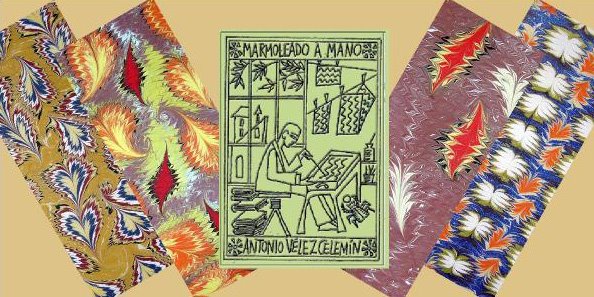
It was a corporative book of the firm "Desigual",
that had to reproduce, on edges and endleaves,
its typical color spots.
The truth is that when I saw the mock-up I thought it would not be so difficult to do,
at least the model was not very complicated.
How wrong I was¡
I returned another mock-up, this time a real one, with blank pages and cardboards,
with what I understood they were asking me.

They liked it, but... they were not the “Desigual” colors.
Very well, I said, and which are the “Desigual” colors?
I asked for a few original color tests,
or a good sample of these colors,
something to be able to reproduce them exactly.
What they sent to me, also by e-mail, were three photos,
in the first one there was nothing to help me,
but it was good to form a vague idea of what they wanted...

... in the second one the colors were very well seen,
but there were not all those that I had to use...

... but in the third one !oh, yes¡ they were there, and with this photo I began to define them.

After several tests we conclude to use eleven colors,
without black, first time I don't use this color,
but with white, since this work I have discovered that
white can make the same function of the black:
to heighten the rest of colors,
the last one of which would be used in a thin splash way,
which would remember the essence of marbling, the drops.
But before I did a test with brushes directly on a paper...

... I have always liked to note down the formula of the colors I use
in a sheet of paper where I write the proportions of the pigments of each one of them,
the way of using them, the order to do it and a not very big sample with a brush.
I have omitted the first two paragraphs that do not appear in the following image.

I thought the work might begin then,
and I did another test on a pair of small blank books to be sure...

... and it was not what they needed.
The colors were acceptable,
brilliant, dense, magnificent,
completely saturated...
... but not the design.
There had to be less streaks, less lines,
and more spots without precise form.
Finally, we verified that there had to be two
different designs, one for the endleaves,
that were going to be printed from my originals,
with the last green splashed on top very lightly,
and a different one for the book’ edges,
because, on being very thin, many of them had the risk to not take just one drop of the green color,
so this second design need to be splashed more intensely…
… and also, it need to be a very versatile design,
it had to work marbling several books simultaneously,
if I had had to paint them one by one
I could never have accepted this work that would have been endless...

... but it was essential that also it could work
individually in every book when each one was separated from the block.

This way, all the books would be "Desigual: not the same",
nevertheless all of them would preserve the same identity,
that one of the firm that had ordered them.
I sent to Barcelona six big papers
so they could choose eight different cuts
that would serve as endleaves, because not all the books were going
to have "exactly" the same ones.
The "Desigual, not the same" concept again.
 The details were chosen meticulously
so that they were not prevailing
neither cold tones nor the warm ones,
all the colors had to appear,
but in a precise balance.
The books were printed,
an edition in Spanish and other one in English,
and the endleaves were printed,
they were bound appropriately,
and they began to send them to me.
Now, yes,
the work of marbling the books' edges could begin.
Although I should have to modifie the colors still one more
time to equilibrate them with those that were appearing in the endleves,
all of them modified during the printing process.
!Farewell¡ to my brilliant cadmium orange,
now slightly more reddish.

Before marbling the edges, it was necessary to group the books,
each one between woods,
with a thin cardboard between every book to compensate the thickness of the tarlatan,
and the whole very well fastened with carpenter’s clamps
so to prevent the entry of water or moisture to the interior of the volumes.
 The first edge to be marbled is that one at the top,
or the low one, in this case you can choose,
then the opposite and, finally,
the forward edge.
It is necessary to kneel down to see
perfectly the front rim,
that must not get dirty at all
and should be marbled last,
when the moisture of the other two edges
prevents the forward edge from being marbled “twice”.

Another complicated moment of the process is
washing the edges to withdraw the gum excess.
It could ruin the work if you use a strong water pressure,
the marbling is waterproofed to the liquid,
but it does not resist the friction in this moment.
So I bought a little engine of those which are used to raise water in
ponds or fishbowls, the smaller that I found,
and I placed it at the bottom of a jug,
and by means of a little tube
I could wash the books without apprehension.

Then it was necessary to give time to dry the blocks...

... to pack and to send the finished books...

... and to recover again and clean the whole used material:
carpenter’s clamps, woods and cardboards.
And begin again.
And again.
And another time again...
...Up to completing all the work.
My friend Aaldert, from the firm Boektotaal,
gave me the secret,
as his father transmitted it to him:
"don’t look at everything you have to do,
simply, start working"
Little by little,
with steadfastness and work,
!it can be done¡

A book designed with a beautiful contrast
between the sober and immaculate binding
and the symphony of color of endleaves and edges,
that answers perfectly to the order.
Marbling, an ancient and venerable technique,
is renewed constantly like a Phoenix bird,
here turned into the suitable vehicle
to express and to translate the identity
of a top firm of the actuality.
***
could you marble the edges of approximately four thousand books, or, are they too much?
My answer could not be any other than:
Of course!, no problem...
I have never been able to say no.
Afterwards, we’ll see how to manage with it.
This is the story of this work,
which held me occupied from the end of last December
till today, March, the seventh, 2011.
A work that has "kidnapped" me
but that also serves me as an excuse
with so many friends that I “haven't” forgotten.
The first thing that I received by e-mail, was a mock-up that was made
at the design study in charge of the project
with the help of a computer:

It was a corporative book of the firm "Desigual",
that had to reproduce, on edges and endleaves,
its typical color spots.
The truth is that when I saw the mock-up I thought it would not be so difficult to do,
at least the model was not very complicated.
How wrong I was¡
I returned another mock-up, this time a real one, with blank pages and cardboards,
with what I understood they were asking me.

They liked it, but... they were not the “Desigual” colors.
Very well, I said, and which are the “Desigual” colors?
I asked for a few original color tests,
or a good sample of these colors,
something to be able to reproduce them exactly.
What they sent to me, also by e-mail, were three photos,
in the first one there was nothing to help me,
but it was good to form a vague idea of what they wanted...

... in the second one the colors were very well seen,
but there were not all those that I had to use...

... but in the third one !oh, yes¡ they were there, and with this photo I began to define them.

After several tests we conclude to use eleven colors,
without black, first time I don't use this color,
but with white, since this work I have discovered that
white can make the same function of the black:
to heighten the rest of colors,
the last one of which would be used in a thin splash way,
which would remember the essence of marbling, the drops.
But before I did a test with brushes directly on a paper...

... I have always liked to note down the formula of the colors I use
in a sheet of paper where I write the proportions of the pigments of each one of them,
the way of using them, the order to do it and a not very big sample with a brush.
I have omitted the first two paragraphs that do not appear in the following image.

I thought the work might begin then,
and I did another test on a pair of small blank books to be sure...

... and it was not what they needed.
The colors were acceptable,
brilliant, dense, magnificent,
completely saturated...
... but not the design.
There had to be less streaks, less lines,
and more spots without precise form.
Finally, we verified that there had to be two
different designs, one for the endleaves,
that were going to be printed from my originals,
with the last green splashed on top very lightly,
and a different one for the book’ edges,
because, on being very thin, many of them had the risk to not take just one drop of the green color,
so this second design need to be splashed more intensely…
… and also, it need to be a very versatile design,
it had to work marbling several books simultaneously,
if I had had to paint them one by one
I could never have accepted this work that would have been endless...

... but it was essential that also it could work
individually in every book when each one was separated from the block.

This way, all the books would be "Desigual: not the same",
nevertheless all of them would preserve the same identity,
that one of the firm that had ordered them.
I sent to Barcelona six big papers
so they could choose eight different cuts
that would serve as endleaves, because not all the books were going
to have "exactly" the same ones.
The "Desigual, not the same" concept again.
 The details were chosen meticulously
so that they were not prevailing
neither cold tones nor the warm ones,
all the colors had to appear,
but in a precise balance.
The books were printed,
an edition in Spanish and other one in English,
and the endleaves were printed,
they were bound appropriately,
and they began to send them to me.
Now, yes,
the work of marbling the books' edges could begin.
Although I should have to modifie the colors still one more
time to equilibrate them with those that were appearing in the endleves,
all of them modified during the printing process.
!Farewell¡ to my brilliant cadmium orange,
now slightly more reddish.

Before marbling the edges, it was necessary to group the books,
each one between woods,
with a thin cardboard between every book to compensate the thickness of the tarlatan,
and the whole very well fastened with carpenter’s clamps
so to prevent the entry of water or moisture to the interior of the volumes.
 The first edge to be marbled is that one at the top,
or the low one, in this case you can choose,
then the opposite and, finally,
the forward edge.
It is necessary to kneel down to see
perfectly the front rim,
that must not get dirty at all
and should be marbled last,
when the moisture of the other two edges
prevents the forward edge from being marbled “twice”.

Another complicated moment of the process is
washing the edges to withdraw the gum excess.
It could ruin the work if you use a strong water pressure,
the marbling is waterproofed to the liquid,
but it does not resist the friction in this moment.
So I bought a little engine of those which are used to raise water in
ponds or fishbowls, the smaller that I found,
and I placed it at the bottom of a jug,
and by means of a little tube
I could wash the books without apprehension.

Then it was necessary to give time to dry the blocks...

... to pack and to send the finished books...

... and to recover again and clean the whole used material:
carpenter’s clamps, woods and cardboards.
And begin again.
And again.
And another time again...
...Up to completing all the work.
My friend Aaldert, from the firm Boektotaal,
gave me the secret,
as his father transmitted it to him:
"don’t look at everything you have to do,
simply, start working"
Little by little,
with steadfastness and work,
!it can be done¡

A book designed with a beautiful contrast
between the sober and immaculate binding
and the symphony of color of endleaves and edges,
that answers perfectly to the order.
Marbling, an ancient and venerable technique,
is renewed constantly like a Phoenix bird,
here turned into the suitable vehicle
to express and to translate the identity
of a top firm of the actuality.
***
Design of the book: Study "Bendita Gloria", Barcelona.
Printing and binding: "Grafiko", Barcelona.
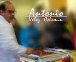
Design and making of the marbling: Antonio Vélez Celemín, Madrid.

No comments:
Post a Comment